
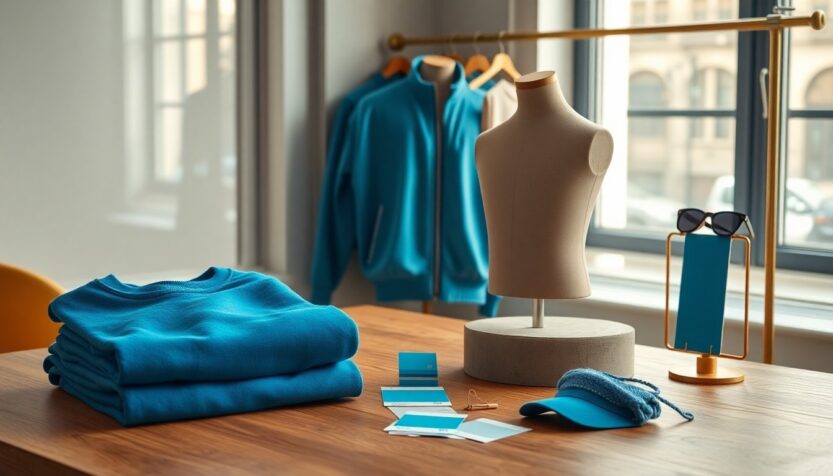
The publicity surrounding the sequel has taken a clever, fashion-first turn: Anne Hathaway’s production company, Somewhere Pictures, has introduced the Cerulean Collection, a limited range of apparel that deliberately references a memorable moment from The Devil Wears Prada. Far from being a throwaway movie gag, the single-shade focus is being treated like a bona fide design statement. The range—which includes T-shirts, tracksuits and caps—is presented as a capsule collection tied to the film’s promotional schedule, translating a screenplay anecdote into wearable merchandise and turning a cinematic color joke into a tangible product for fans and fashion-minded buyers.
That cinematic anecdote is the famous exchange about cerulean, where a high-fashion editor explains the cultural and commercial value of a particular blue sweater. The new drop leans into that lore: Hathaway was photographed wearing garments in the exact hue associated with that conversation while preparing for the film’s premieres. The project purposefully foregrounds the concept of a signature shade, treating the color as a central identity element for the sequel’s promotional era rather than as a mere merchandising afterthought, and thereby reviving interest in how film and fashion can intersect on a single tone.
The design and the dialogue
Rather than producing generic branded apparel, the team behind the campaign translated the film’s line into a distinct visual language. Each piece carries a graphic inspired by industry color systems and a clear reference to the screenplay moment, positioning the garments as both collectible merch and cultural commentary. The production’s aim is twofold: to reward dedicated viewers who remember the original joke and to make the shade itself a talking point for new audiences. By elevating cerulean from shorthand to emblem, the collection reframes a film beat as an emblematic color story that can be worn on the street and discussed in fashion circles.
The color code and the branding mechanics
One of the campaign’s most notable moves is the assignment of a formalized color identifier: DWP2-010526. That code functions as an internal tag—standing for Devil Wears Prada 2 followed by the film’s U.S. release date, May 1, 2026—and it appears on select garments as part of the visual narrative. Using this alphanumeric marker underscores how the project blends cinematic metadata with fashion labeling, turning a date and title into an element of design. The approach deliberately nods to the precision of branding systems while keeping the wink of the original movie moment intact.
Pantone nods and industry reactions
The Cerulean Collection is not a Pantone registration; rather, it riffs on the language and aesthetics of color houses. The team adopted a Pantone-like treatment for some graphics to evoke that institutional color authority, and the gesture received light public notice from the color community. Comment threads and social posts referenced the resemblance, and official accounts offered brief, appreciative responses. This exchange highlights how the project balances playful homage with respectful acknowledgement of the real-world systems that standardize color across design disciplines.
How the world tour drops work
Another deliberate feature of the rollout is the city-by-city merchandising strategy. Drops are synchronized with international premiere dates and retail availability, and early releases included Mexico City, Tokyo, Shanghai and Seoul—each item labeled with local-language typography and references. The collection’s distribution model treats the promotional tour like a rotating pop-up, giving each market a moment to claim its own version of the shade. This localized approach amplifies excitement in each city and encourages collectors to follow the tour if they want a full set of regional editions.
Where to find the pieces and what it means
At the moment, select drops are live on the Somewhere Pictures web store, and fans can expect further releases aligned with additional tour stops. The line’s core items—T-shirts, sweatshirts, caps and tracksuits—are framed as accessible entry points into a broader film conversation, allowing wearers to reference a cinematic punchline while participating in a coordinated marketing moment. By treating a single color as both a narrative device and a merchandising anchor, the campaign demonstrates how a memorable film line can evolve into a sustained cultural touchpoint, blurring the lines between costume, costume reference and consumer apparel.