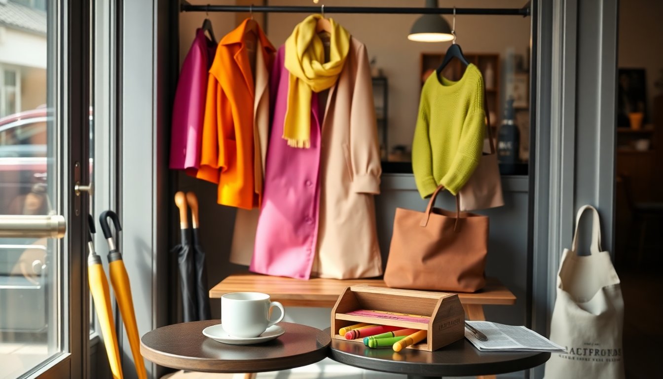
When I push open the café door in my neighborhood, the room usually reads like a monochrome photograph: a lot of dark coats, muted tones and quiet silhouettes. One weekend, though, the scene shifted — like finding a cheerful box of crayons spread across a rail. The contrast between that ordinary urban backdrop and a handful of people wearing unapologetically bright pieces made me rethink how color functions in everyday life. The presence of crayon colors didn’t feel costume-y or overpowering; it read as friendly, readable and immediately optimistic.
The rise of saturated tones in wardrobes ties into a larger conversation about the spring 2026 trend toward bold simplicity. By primary colors I mean the uncomplicated red, blue and yellow family — hues that read as immediate and pure — but the crayon palette also includes softer tones that recall waxy, nostalgic pigments. Wearing these shades is less about following a fashion rulebook and more about embracing a visual language that communicates confidence and ease. Small shifts, like a bright sweater or a striped tee, can rewrite your daily look without asking for a complete overhaul.
Why saturated hues feel fresh right now
Color can change perception quickly: a pop of brightness draws the eye, creates contrast and simplifies an outfit’s narrative. The appeal of primary colors lies in their clarity — they act as visual anchors when paired with neutrals or layered with other bold pieces. Psychologically, vivid tones tend to lift mood and signal approachability, which explains why someone in a cobalt coat or a cherry cardigan seems to beam even on gray days. This isn’t about maximalism for its own sake; it’s about selective impact. Choosing one or two concentrated pieces allows you to experiment with color blocking while keeping proportions and silhouette uncomplicated.
How to wear crayon-inspired hues
Mixing and matching for everyday life
Start small if you’re unsure: a crayon-colored accessory — a beanie, a tote or a pair of socks — introduces brightness without overwhelming an outfit. When you’re ready to scale up, combine a vivid top with classic, neutral bottoms to let the color read as intentional rather than costume-like. Another approachable strategy is pairing two saturated items in the same tonal family (think marigold and honey) or opting for a single bold piece against a field of black, gray or denim. Use color blocking sparingly; the trick is balancing visual weight so the outfit feels curated rather than chaotic.
Dressing for different occasions
For work settings, consider structured silhouettes in saturated fabrics: a tailored blazer in a bright hue reads professional when paired with simple trousers and minimal accessories. Weekend dressing invites more play: slip into a striped tee or a playful skirt and layer textures like corduroy or knit for depth. If you worry about attention, choose matte finishes over glossy ones; matte saturation tends to read as more wearable and less flashy. Ultimately, placement matters — a bold sleeve, collar or hemline positions the color as an accent that can be dialed up or down depending on the context.
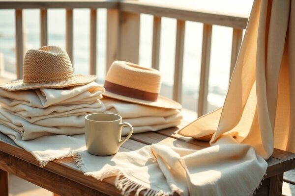
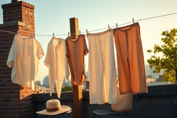
Practical tips: shopping, fabrics and care
When investing in colorful pieces, prioritize fabric quality and dye stability. Natural fibers like cotton and wool often hold pigments differently than synthetics; read labels and look for descriptions that note colorfastness. Try garments on in daylight if possible, because artificial lighting can shift how a hue reads. For longevity, wash bright items with like colors, use gentle detergents and turn pieces inside out to reduce abrasion. Small rituals — air drying, avoiding harsh chlorine bleach and storing items away from direct sun — keep those crayon-like tones looking fresh season after season.
Final thoughts
Adopting a palette of crayon colors is less a trend and more a recalibration of how we use color to express mood and intention. Whether you dip a toe in with accessories or embrace a head-to-toe statement, these hues offer a straightforward way to refresh your closet and your outlook. The scene in that café — a bright sweater catching the eye among a field of dark coats — felt like a gentle reminder that clothes can be both practical and playful. (published: 31/03/2026 21:30)