
Alison Piepmeyer—designer and writer—lives with her husband Zach and their two children, Linus and Georgie, in a nineteenth‑century Brooklyn brownstone photographed here by Lyndsay Hannah. The house reads like a personal museum: original woodwork and staircases anchor rooms that Alison has layered with vivid paint, books and small objects collected over years of marriage. The result feels lived‑in and intentional at once—an archive of family life set against a dignified historic shell.
A slow renovation, not a reset
They didn’t gut the place and start anew. Over several years the family repaired windows, refinished floors and restored mouldings, then introduced contemporary touches that let their belongings breathe. Bold wall colour—deep, saturated hues Alison calls “dramatic”—frames shelves the way a museum mount frames a work of art. Textures and tones are used sparingly but decisively, so the architecture remains legible while books, ceramics and prints take visual priority.
That balance—conservation first, personality second—keeps the home from feeling either precious or anonymous. New shelving and built‑ins read as continuations of the original fabric, not replacements. Where change was necessary, the interventions were chosen to be reversible or sympathetic to the old materials so the house can age gracefully with the family.
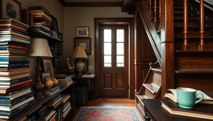
Books, colour and accumulation
Shelving is the structural heart of the interiors: rows of volumes set sightlines, break up space and create pockets for display. Small ceramics and framed prints punctuate those shelves, creating little conversations across rooms. Colour ties spaces together—repeated accent tones nudge the eye through the plan and make the house feel cohesive without resorting to a single neutral palette.
Collections here didn’t arrive as a design brief. They accreted—gifts, travels, thrifted finds and well‑worn reference books that mark the family’s interests. That provenance matters: objects and the stories behind them give the rooms emotional weight and a sense of continuity that no new purchase could replicate.
Practical and preservation-minded choices
Renovating a period property involves more than aesthetics. Visible changes to façades or to key historic fabric can trigger approvals in many jurisdictions, and doing work without the proper permits risks enforcement or costly undoing. Alison and Zach’s approach—documenting contractor work, choosing reversible fixings and prioritising repairs that protected original material—kept the project both legal and long‑lasting.
For anyone tackling a similar house, a few concrete moves make a big difference:
– Check local preservation rules and consult officers early in the process.
– Prioritise reversible or freestanding shelving rather than drilling into historic plaster.
– Keep records: permits, photographs before-and-after, contractor warranties and a simple inventory of valuable items.
– Use durable finishes and fabrics in high‑traffic zones; reserve delicate treatments for less-used spaces.
– Store fragile or seasonal items in archival boxes and label them.
Making a family home, not a showpiece
The Piepmeyers favored keeping long‑lived furniture and heirlooms instead of replacing everything. That decision gives the house a “lived‑in texture”: cushions that bear memory, surfaces that show use, shelves that invite touch. Practical needs shaped design choices as much as taste—child‑friendly seating, accessible shelving and finishes that tolerate everyday wear keep the house both beautiful and useful.
Photographer Lyndsay Hannah’s images underline that point: the house is not a carefully staged set but a place where architectural detail and domestic objects coexist. The photograph of a painted nook bursting with books reads as an example of design that serves life, not the other way around.
A guiding mindset
What the Piepmeyer home demonstrates is simple: preservation and personality don’t have to be in opposition. Start with conservation—repair what matters most—then use colour, texture and thoughtful displays to let your belongings tell the story. Group books by height, colour or theme to create rhythm. Use a limited set of accent hues to unify disparate pieces. Think in terms of reversible decisions so future owners or conservators can step in without undoing family history.
A slow renovation, not a reset
They didn’t gut the place and start anew. Over several years the family repaired windows, refinished floors and restored mouldings, then introduced contemporary touches that let their belongings breathe. Bold wall colour—deep, saturated hues Alison calls “dramatic”—frames shelves the way a museum mount frames a work of art. Textures and tones are used sparingly but decisively, so the architecture remains legible while books, ceramics and prints take visual priority.0